The Key Differences Between Charts and Graphs Explained
As a data expert, you have to deal with various presentation methods like charts and graphs. By now, you should not be struggling to understand that these two have some differences unless you are a beginner. If you look carefully, you will notice that all graphs are forms of charts, but the latter are not necessarily graphs. To clear the air, we will look at the major differences between the two so that both beginners in data and experts can both easily understand it. Read on to learn more.

What is a Chart?
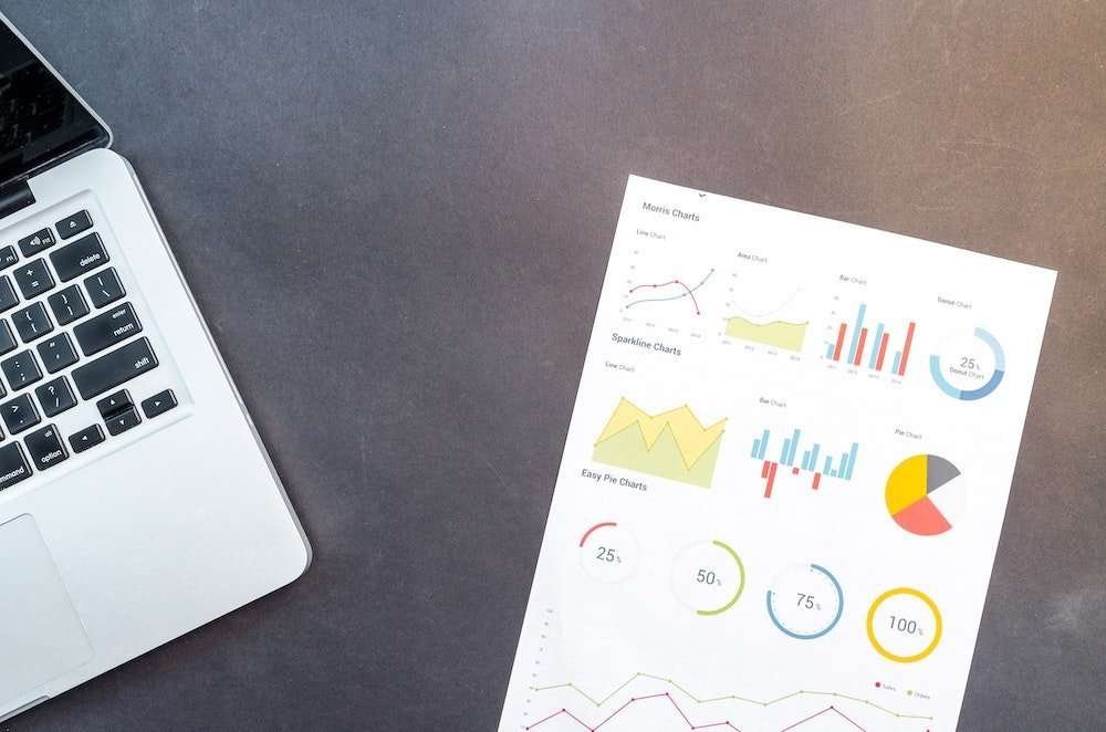
These are visual representations of data that are either related or unrelated. They aim to make users understand large data sets with ease. According to experts, charts can look like graphs or diagrams. It depends on which makes it easier to present the data to the users. Apart from making data simple, charts can categorize data. This will make it clear and company management can just look at it and make clear decisions.
The different types of charts include the following:
- Pie chart – If you want to cluster your data and present it out of a total, this is the best option to use. The data sets are primarily given in percentages.
- Bar charts – This is a graphical presentation of data. When you have large data sets given in numbers, this is a good option to use. The data must not be related.
What is a Graph?
Graphs usually deal with raw data that is presented in a chart that relates them. It usually depicts a trend over time. The relation between the two data variables is shown using a line. Thus, there is a y-axis and x-axis. Graphs are also called line charts.
It is common for ActiveWizards experts to use graphs when they want to know the relationship between a certain range of raw data. For instance, they will input years on one axis and buying trends on the other to find a relation.
Are There Other Key Differences?
Yes. We said that charts usually deal with large data sets that must not be related. They will present them in attractive patterns so that entrepreneurs or the top management in an organization will have a quick visual glance of how things are. This will do well with data that is already determined and categorized into clusters.
On the other hand, graphs are used to identify a trend in certain data. That is why raw data is used for one side and variables will determine the other. A line is drawn where the two variables meet so that people can observe the trend at a glance. It is possible to merge many graphs into subjects have similar data variables. For instance, the sales trends of different commodities over the years can be presented in one line graph. In this case, each commodity will be shown by a different line.
Conclusion
If you are a beginner in data management, you now know the key differences between these two data presentation tools. You will be using them daily, so it is important to understand how they work. It is good that you have gone through this article and already know where to start.
