Build an Awesome Daisy UI WordPress Theme - Part 3
Daisy UI is an awesome selection of Tailwind components for your next WordPress classic theme. You can have your custom theme up and running within a few weeks. In the first part of the series, we set up the environment to build an awesome Daisy UI WordPress theme and added a basic layout, footer, and navigation in the second part. This part features jazzing up the search form in the navigation, making it a little more mobile-friendly and adding a sidebar and widgets.
- Part 1 – Setting Up
- Part 2 – Adding Nav, Footer
- Part 3 – Mobile Friendly, Navigation, Widgets – You are here
- Part 4 – Post navigation, comments and Post Meta
My Apologies
Sorry, this part has taken so long to publish. I am in year four of a part-time degree and working full-time in education has given me little time to code and write blog posts. I am off for the summer and start my fifth and final year in October. Hopefully, I can finish this series before then.
Dependency Changes
Since the previous parts were published there have been many changes to the infrastructure. Node has been updated, using NVM, to 22. If you have already set up your environment you can use npm-check-updates to update your dependencies otherwise clone part 3 of the repository on github. Just in case you have missed other parts in the series here you can find part 1 and part 2.
1npx npm-check-updates -u
Followed by:
1npm install
Navbar Changes
The search function at the end of the navbar has been tweaked to add styling to it. I have added a searchform.php file to style it. The unique_id variable is generated so if you have multiple search forms it generates an id value for each search form. This ensures that it is valid. New changes have been made to header.php to make it more responsive. A drop-down menu will appear on small screens. It uses the wp_nav_menu, which is registered in functions.php. It can be configured to show the same navigation as the main menu. This will result in the menu in the middle being hidden on smaller devices.

The locations are both assigned the same menu.
Layout Changes
I have made the theme more responsive using CSS Grid. There is a two-column layout on a screen larger than 768px, with the first column being the largest. On smaller screens, the main content appears on top and the sidebar appears below it.
Sidebar and Widgets
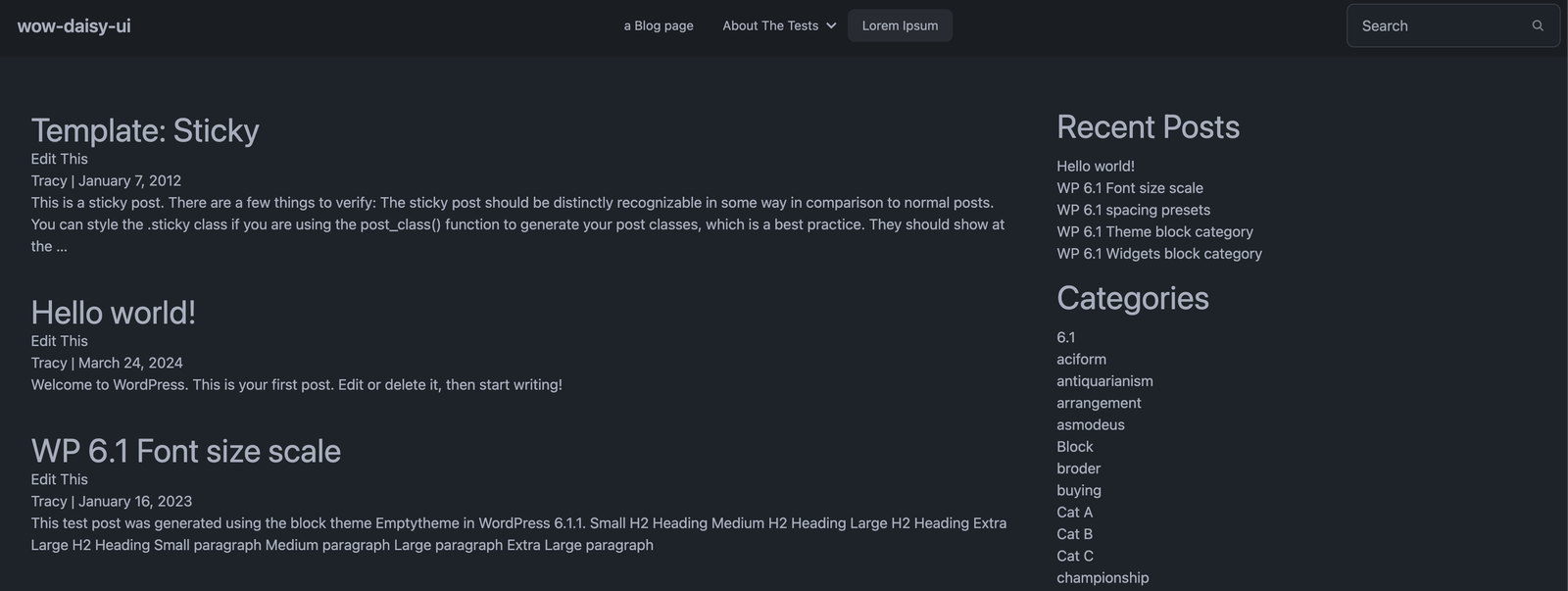
In the sidebar, I have added a couple of widgets to display the latest posts and the categories. It’s a pretty old-school blogging layout. To style the widgets using the modern blocks-based widgets editor I added additional CSS classes to dev/index.css. These CSS classes will be included by default as Tailwind doesn’t know if you use CSS classes in the frontend editor. I have only added the CSS required for the widgets I have used. There is a full list of CSS classes for widgets on GitHub if you need to add any more.
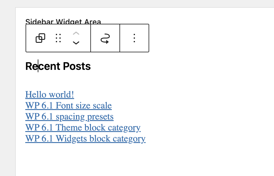
Block-based Widgets Editor in WordPress 5.8

Adding a widget group.I added the widgets as a widget group and this created the following source code. I have removed a few posts and categories to make it easier to read.
 1<div id="primary" class="widget-area">
 2   <ul class="xoxo">
 3      <li id="block-8" class="widget-container widget_block">
 4           <h3 class="widget-title">Recent Posts</h3>
 5             <div class="wp-widget-group__inner-blocks">
 6                <div class="wp-block-group">
 7                    <div class="wp-block-group__inner-container is-layout-flow wp-block-group-is-layout-flow">
 8                        <ul class="wp-block-latest-posts__list wp-block-latest-posts"><li><a class="wp-block-latest-posts__post-title" href="http://wow-daisy-ui.local/hello-world/">Hello world!</a></li>
 9                           <li><a class="wp-block-latest-posts__post-title" href="http://wow-daisy-ui.local/wp-6-1-font-size-scale/">WP 6.1 Font size scale</a></li>
10                           <li><a class="wp-block-latest-posts__post-title" href="http://wow-daisy-ui.local/wp-6-1-spacing-presets/">WP 6.1 spacing presets</a></li>
11                           <li><a class="wp-block-latest-posts__post-title" href="http://wow-daisy-ui.local/theme-block-category/">WP 6.1 Theme block category</a></li>
12                        </ul>
13                    </div>
14                </div>
15           </div></li>
16      <li id="block-9" class="widget-container widget_block">
17          <h3 class="widget-title">Categories</h3>
18             <div class="wp-widget-group__inner-blocks">
19                <ul class="wp-block-categories-list wp-block-categories">
20                    <li class="cat-item cat-item-2"><a href="http://wow-daisy-ui.local/category/6-1/">6.1</a></li>
21                   <li class="cat-item cat-item-3"><a href="http://wow-daisy-ui.local/category/aciform/">aciform</a></li>
22                   <li class="cat-item cat-item-4"><a href="http://wow-daisy-ui.local/category/antiquarianism/">antiquarianism</a></li>
23                </ul>
24             </div>
25       </li>
26    </ul>
27</div>
How it Looks

Todo
As you can see many more features need to be added in future parts.
- Theme – Default Daisy UI theme
- Automatic light/dark mode
- Footer
- Navigation
- Search
- Mobile friendly
- Sidebar
- Next/Previous Post
- Homepage
- Post Meta
- Comments
Conclusion – Daisy UI WordPress Theme Part 3
This concludes part 3 of building an awesome Daisy UI WordPress theme. There are many more changes to be made in the upcoming parts including next/previous post navigation, comments and post meta. Stay tuned! Please feel free to get in touch If you have any questions.
